BLACKBERRY FARM BREWERY
RESTARAUNT / BAR / BREWERY

BLACKBERRY FARM BREWERY
COMPLETION YEAR:
2019
LOCATION:
Maryville, TN
SIZE:
3,043 SF
AWARDS:
Excellence in Restaurant + Bar Design IIDA Tennessee (2019)
PROJECT DESCRIPTION:
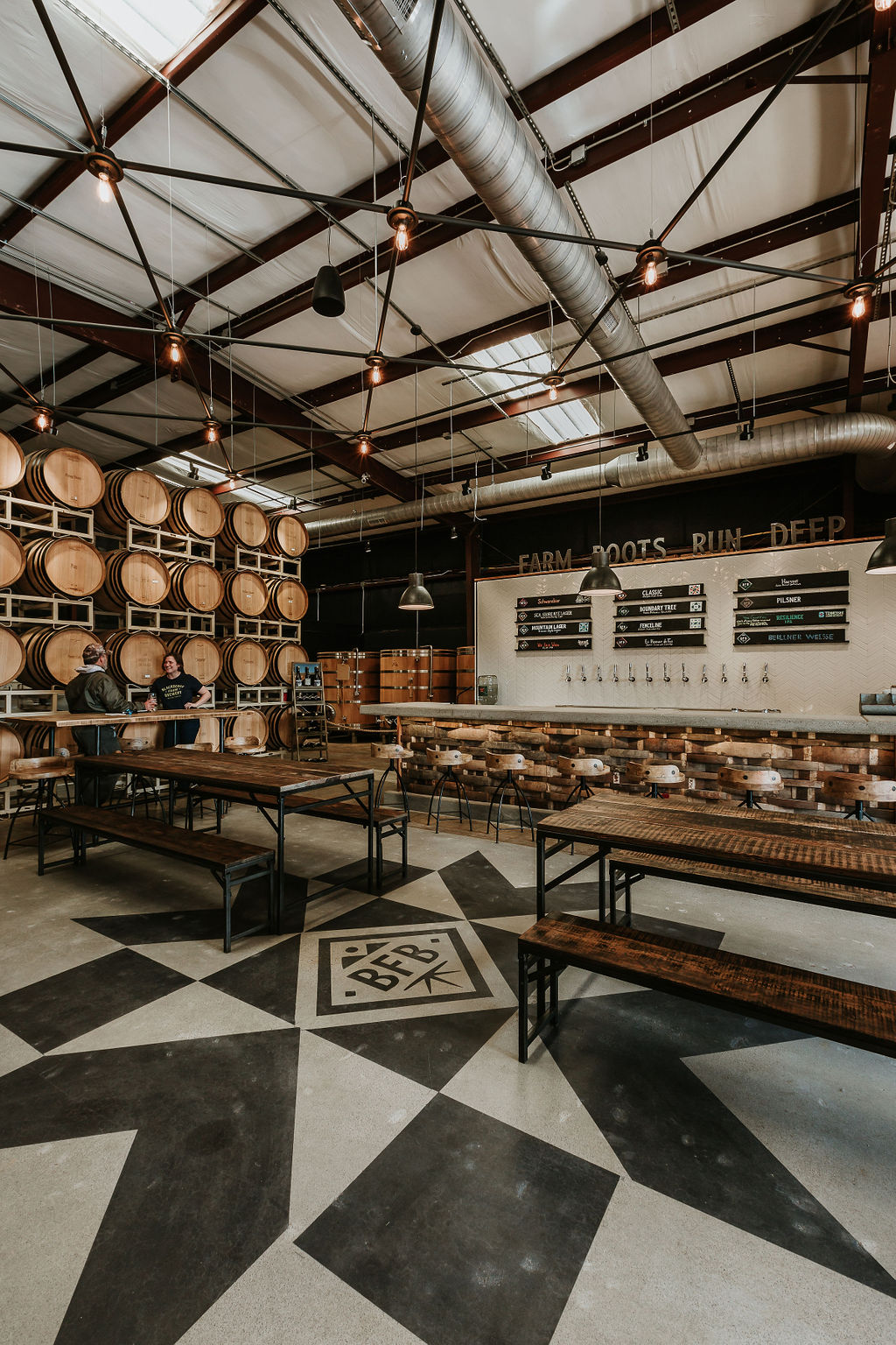
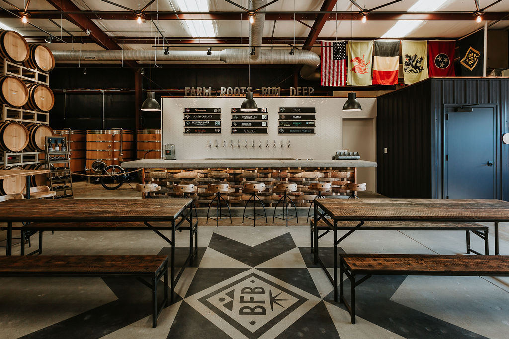
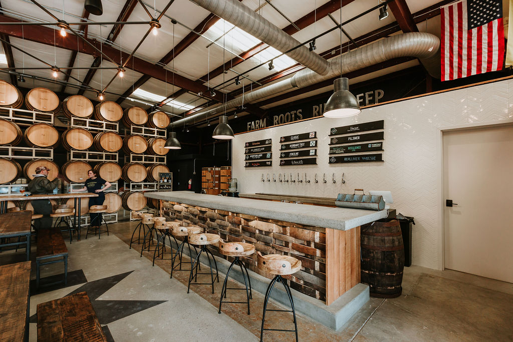
Blackberry Farm Brewery expanded its presence in Maryville, Tennessee, by transforming a 3,043 SF pre-engineered metal building into a welcoming taproom. MHM reimagined the space to function as both a working brewery during the day and a gathering place at night while staying true to Blackberry Farm’s signature rustic elegance and craftsmanship.
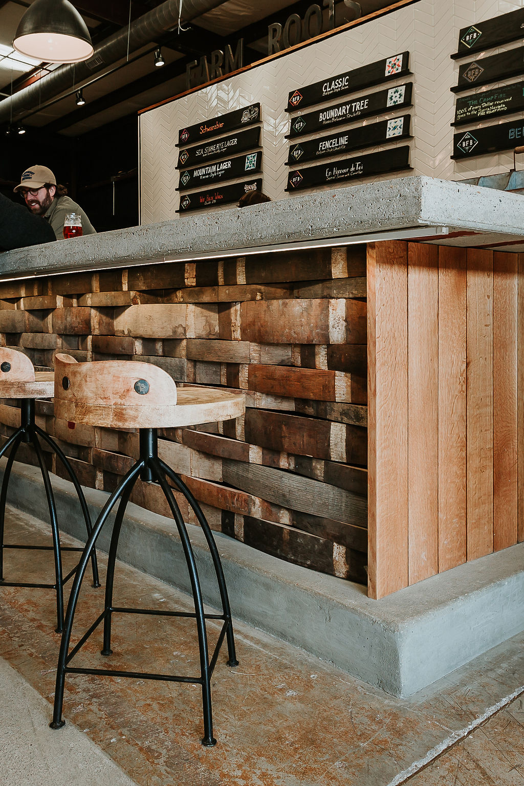
The renovation introduced warm, textural materials that reflect Blackberry Farm’s signature rustic elegance. A poured concrete bar, custom light fixtures, whitewashed wood plank, chevron patterned tile wall surfaces, and reclaimed wood staves from aging barrels create an inviting atmosphere. Utility upgrades included new insulation, restroom facilities, office and retail space, and a tasting bar.
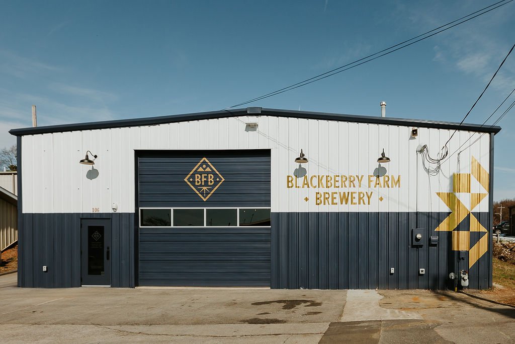
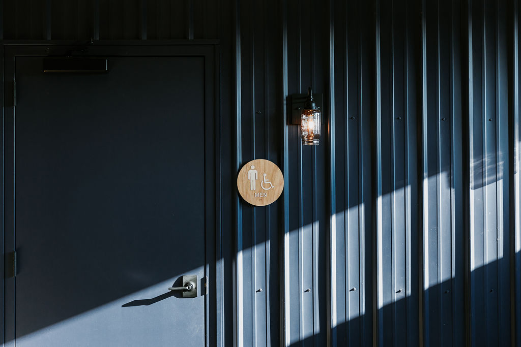
Exterior updates, including repainting in a two-tone color scheme, new graphics, and lighting, enhanced the brewery’s street presence, seamlessly blending craftsmanship with community.
PHOTOGRAPHY: © Chris Smith Photography / MHM
Check out The BFB shoutout in Bon Appetite Magazine!


